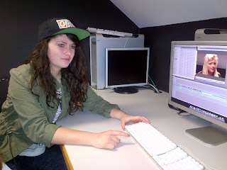
Here is our completed preliminary task!
Monday, 22 October 2012
Sunday, 21 October 2012
Editing Our Preliminary Task!
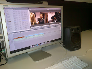 |
| Final Cut Pro |
Learning to edit was not as difficult as I thought it would be. Our group (Simon, Leila and I) had all edited a bit before, but never with Final Cut Pro. We were taught how to Check In, by signing in to the Final Cut Server. From there, we retrieved our footage in the folders marked with our names. It was very organized and useful to have the Server! We checked out our footage to the desktop, and from there we were ready to begin editing.
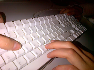 |
| Using Keypad Shortcuts |
To organise the shots, we made a Rush Bin and a Log Bin. The Rush Bin is where we copied the all of the shots that we had, to keep them organized. The Log Bin was where we copied the takes that we actually used in the editing process. It was important to copy the shots and not just drag them in, in case we forgot to save or accidentally deleted something.
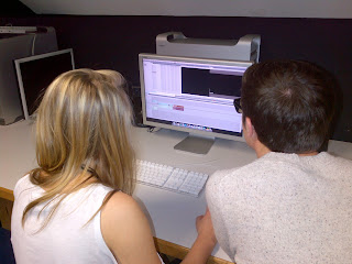 |
| Simon And Leila Editing |
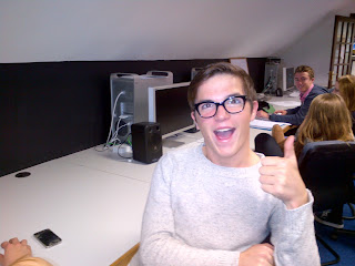 |
| Simon Loves to Edit! |
Although we all agreed that the editing process went well, next time we thought we would be faster and more familiar with the technology. I most enjoyed watching
back the footage and deciding what to copy to the Log Bin. Seeing what we had filmed before was
interesting to me. Watching the
finished product was interesting and satisfying.
Saturday, 20 October 2012
Sound Use in Hanna
The
combination of diegetic and non-diegetic sound allows us to perceive Hanna as a
skillful, trained agent and ultimately as the protagonist. The harsh buzzing in the cell
(amplified) as well as the fact that the woman says “You’re in a safe place,
sweetie,” while being fed lines through a walkie talkie/earpiece leads us to
believe that in fact she is not in a safe place, that she must try to escape
the cold, bare cell. The metallic
thud and heavy amplified synchronous sound of the cell door let us know that
escaping the cell would be difficult.
The non-diegetic soundtrack that begins to play after Hanna cracks the
woman’s back is fast-paced, emphasizing the urgency of her situation.
Friday, 19 October 2012
Thriller Idea Pitch FEEDBACK
Today,
we presented our thriller concept to Matt and Simon. Their initial reaction was that it was a cool idea, quite
basic and out of the ordinary.
Their main criticisms were that the boy (murderer) had too much screen
time, which would make the audience emphasize with him. I agreed with this point, however, the
point where he is walking around the suburb is a large part of the
concept. A solution to this might
be only staying with the perspective of the killer. We could give him positive
characteristics to experiment, to see if the audience can sympathize with a
murderer. I really like this idea; I hope we get a chance to try it.
A
different direction we could take would be that we don’t know IF he has killed
anyone, we can only suspect. It
would create suspense, a great addition to any thriller!
Another
criticism that Matt had was that we might have too many locations. This would make it inconvenient to film
and also that there would be too much going on. By limiting the locations, we could focus more on the
filming, editing and mise-en-scene.
An
important part that they mentioned was the actor for the mother. She would need to be very skilled and
to have the “mum-look”, otherwise it would ruin a substantial part of the
scene. He said, “You can’t have
some Hollyoaks girl play the part, it has to look believable!” which we thought
was quite funny. It’s a difficult
role that we would be asking them to play because it is unusual.
They
thought that the story was interesting.
As our society is familiar with school massacres, it would show a
different perspective with the mother.
A negative side of this was that it would turn into more of a drama,
rather than a thriller. Adding a
voiceover of the boy’s thoughts would bring back the thriller mood; we could
emphasize his mental characteristics in this way.
Matt
and Simon stressed that in order for the opening sequence of a film to work,
one must film “choice shots”. These are the shots that stick with the audience,
even after the movie.
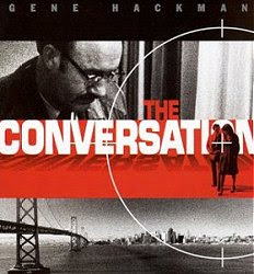
Here is a choice shot from one of the films that inspired our thriller:
Here is a choice shot from one of the films that inspired our thriller:
Thriller Idea Pitch
The idea that Simon, Leila and I
decided to present to Matt and Simon was our concept of a boy walking home from
school after having committed murder at his school. He was meant to be the perpetrator of a school
massacre. The sequence would be
filmed mainly from the point-of-view of the mother. As he walked home on a sunny (probably winter as we’ll be
filming in February) day, contrapuntal music would be playing, or birds would
be singing to add to his twisted character. He would look disheveled and have blood on his hands. During
this time, his mother would be seeing the massacre reported on the news. Her
reaction would be shocked and fearful for her son, not knowing that he was not
the victim. He would then come up
to the door, she would ask how he wasn’t at school, and he would reply,
“School’s cancelled today,” or something else creepily.
We were
inspired by the movie “We Need To Talk About Kevin” and a clip that Simon
showed us from “United States of Leland”.
What we liked
in the opening sequence of “United States of Leland” was the crane shot going
over, as well as the peaceful setting of the suburban area.
We
chose this idea to pitch because we thought it would be an interesting
perspective on school violence. We liked the juxtaposition created by the
violent act and suburban life. We
felt that the concept was simple enough to be filmed well, and that although it
was about violence, nothing violent would actually need to be filmed. Hope it will be received well!
Opening Sequence
The opening sequence is an integral part of a film. It foreshadows main events, sets the time and place, can introduce characters, and indicates the type of thriller. It mainly does this through the mise-en-scene (showing location, signifiers such as weaponry, people such as detectives or spies), but also through the other three technical areas. Camera, through close-ups, dutch angles, or extreme close-ups, create meaning and can distort the images in an interesting way, creating tension or confusion, both integral to the creation of a thriller. Sounds are can create meaning as well, through non-diegetic sounds such as tense or frightening music and sounds effects (shatter, high-pitched noises) or synchronous diegetic sounds to match the thriller-type action on screen (explosions, gunshots, screams). The editing can be very effective in creating a thriller atmosphere in the opening sequence, by quick cuts, the text of the credits, flashbacks, different washes (black and white, shatter effects...) as editing creates meaning by putting the images together.
 |
| The surveillance camera wash gives a trapped/watched feeling, creating tension and suspense. (Film: Quarantine) |
The main title sequence indicates the types of characters and the setting of the film. It creates verisimilitude in the opening minutes of the film. This is done through editing for perspective and camera angles, which may indicate what type of character we are seeing (spy, police officer, victim...) by showing things from high angles (looking down as antagonist) or low angles (victim) or through eyeline match (a police officer seeing a crime). Sound can characterise through non-diegetic music, for example dark, loud music for an antagonist. Sound also sets the scene, for example using ambient sounds of wind or people talking to show either a remote place or a city.
 |
| The ambient sounds of wind on a mountain are interrupted by an explosion! |
Learning to Use the Camera
Today, we learned how to use the camera in the film
studio. The cameras we were
learning to use were the Sony NX5:
Next, we got the camera out of the padded case and attached
it to the tripod, which was also quite easy. To do it, you just needed to slide the camera on the base of
the tripod while holding down the top button and wait to hear the click.
After the camera was securely on the tripod, we put the
battery into the battery compartment and were instructed how to open and close
the lens. I found the lens shutter
switch to be very entertaining!
Now was the time when we actually turned on the camera. The small red “ON” button was difficult
to find, which was a good innovation, so that one doesn’t accidentally press it
while filming.
To make sure that the camera would shoot on-level, we had to
“bubble” it. The small green disk
on the tripod, which had a small bubble in it was the tool to do this
with. When the bubble was in the
middle of the small circle, it would be centered. We took a lot of time to do
this; it was tedious but of course essential for filming.
We learned how to white-balance, which means that we matched
the light perceived on the camera to the actual light, so it wouldn’t turn out
a different/dull colour. To do
this, we used Simon’s shirt (which was white) and pressed the small
white-balance button on the left hand side of the camera. There was also a large sheet-like disk
used for white balancing, which would be useful when filming, so that the film
crew doesn’t have to hunt down something white to balance to! We experimented
balancing indoors and outdoors, looking at how different lights could be
used.
 |
| Examples of White Balancing |
There were a lot of intimidating buttons on the camera, but
by the end of the lesson, we were familiar with almost all of them. The dials near the lens of the camera
were important to know how to use.
There were three dials: zoom, focus and exposure. The zoom one was evidently for zooming
in and out. The focus was to focus the camera, so it wouldn’t be blurry. To do
this, we needed to zoom into whatever we were about to film, focus on it, and then zoom back out to the range we
would be shooting at. It made for
a very clear picture. The exposure dial was to change how bright the scene was,
but we didn’t really use it since we had our light sorted out with the
white-balance.
An interesting thing that we experimented with, with the
cameras was the use of shutter speed.
By changing the shutter speed on the display screen, the quality and realistic
look of the film was dramatically altered. Increasing shutter speed made for a surreal effect,
everything being very defined and quick. Matt waved his hand in front of the
camera fairly quickly at shutter speed 215, which made it look like his hand
just had a ridiculous amount of fingers.
Decreasing the shutter speed made the film look very low quality,
everything in slow motion. The
optimal shutter speed is 25 frames per second.
 |
| An Interesting Example of Shutter Speed |
I found it really fun and interesting to be learning how to
use the cameras! It was fascinating to see all the things the cameras could do,
all the different ways they could be experimented with. It was a nice change from staying in the classroom as well!
"Children Of Men" Poster Analysis
The “Children Of Men” poster is an ideal post-apocalyptic
thriller poster. The scene is set
with the bold, red, upper-left-hand corner text reading “THE YEAR 2027:
…”. The man on the poster is the
presumed protagonist, judging by the fact that he is looking out from the
broken glass with a weathered face, smiling slightly. His eyes are light and hopeful. The poster is lighter around his face, suggesting that he is
good. This is further manifested
through the text, “He is our only hope.”
The dark shadows around the rest of his body, as well as the broken
glass around his face, show that he is trapped and surrounded by evil. The broken glass in front of his face
also suggests that he will overcome it.
The broken part of the glass is almost in the shape of a club
(frequently the unlucky suit used in cards) which insinuates that he is in a
bad situation. The light next to
his face also represents hope. He
must crack the puzzle (or the glass) in order to save the day, foreshadowing
violence and relating with our perception of the thriller genre.
"The Girl With The Dragon Tattoo" Poster Analysis
The mise-en-scène of this poster
conforms to society’s idea of a thriller.
The dark colours, contrasting with the red dragon, are the colours of
fear, death and hostility. The
face of the girl (in the background) is covered by shadows and the dragon,
suggesting that she is hiding or that she has something to hide. Her facial expression is serious but
feminine, due to the slight pink colour of her lips and feminine
eyes/brows. The dragon is red,
symbolizing blood, passion and conflict. Its tail drips down the poster, into a
cloud of what seems to be blood.
The rest of the poster is mainly dark, connoting mystery and
secrecy. The capitalized, white
text reads “GIRL DRAGON TATTOO” while the “THE (girl) WITH THE” is in red and
is smaller. This may imply that
the girl has dragon-like characteristics, that the dragon is a permanent part
of her, much the way that a tattoo is.
The film poster conforms to our idea of a thriller because it is
mysterious, dark, and holds a certain amount of suspense.
Thursday, 18 October 2012
"The Conversation" Poster Analysis
"The Conversation" poster gives the sense of a psychological or espionage thriller. The black and white give the film poster a serious tone, while the red suggests conflict and bloodshed. The old man's eye line is focussed on the couple, walking on the red banner. This suggests that he is watching them as well as that they are in danger. The target on them confirms that they are under surveillance. The target also gives the sense of an espionage thriller. The relaxed stance of the couple insinuates that they do not know that they are being watched. The bottom banner, a black and white cityscape, sets the scene for the film. The fact that the older man is looking down on them, as well as on the city, suggests that he can find them easily, that he is powerful in the film. His glasses and moustache create a scholarly, intelligent look, furthering his power. The shadows that he creates give connotations of evil as well. The bold text, "THE CONVERSATION", brings the attention of the viewer to the middle of the page, while the shadows that it creates foreshadows danger. The black banner at the top of the poster implies serious circumstances, the black colour also representing death.
The Usual Suspects - How Can We Tell That It's A Thriller?
There are various clues that indicate that "The Usual Suspects" as a thriller, in particular, a gangster thriller.
From the poster, we can deduct that the group of men have committed crimes, due to the line-up wall, text ("five criminals. one line up. no coincidence"), and the general appearance of the characters. The large suits connote the "mob style", while the stances of the characters show their place within the gang. The character in the middle, surrounded by the others (black suit) is physically the largest/tallest, insinuating that he is the leader of the gang. His confident expression and red shirt also connote that he is a womaniser. The character to his left, in the long, black leather coat is in an aggressive and confident stance. This implies that he is the supplier of the weapons, the muscle of the group. The man on the far left, dressed in garage work clothes is most likely the one who supplies the vehicles or the transport to the gang. The man on the right of the middle man, dressed in a tan suit and tie looks uncomfortable in the situation. His work-attire conveys him to be intelligent, probably the "brains" of the operation. The last man, on the far right, is contrastingly unintelligent-looking, by his slouched stance, strange haircut and vest. The line-up may be described as the life-cycle of a mobster, starting out in the garage, rising to the top and then eventually wanting to break out of the lifestyle.
The impact of this group together manifests that they are a gang, each having something different to contribute to the operations.
The opening scene of "The Usual Suspects" can classify the entire film as a gangster thriller through the mise-en-scène, camera, sound and editing.
The mise-en-scène most obviously insinuates the film to be a gangster thriller. The setting, a ship in a shipyard, is a very classical setting for mob "goings-on" to happen.
The matches and fire in the scene signify danger. The fact that the man is smoking represents him to be a stereotypical mobster. He used the rest of the pack of matches to light his one cigarette, insinuating that he is the victim or knows that it may be his last. The next character to come on screen is in a long black coat, his face hidden in the shadows, representing him to be evil. He puts out the trail of fire that the victim man lights, by urinating on it. This action shows him to be dominant in the situation, further enforced when he stands above the victim, patronising him, "How you doin', kitten?"
The diegetic sounds of water dripping and the fire crackling are enhanced, making them louder. This creates a more tense atmosphere due to the speed and the use of fire to represent danger or escape. The non-diegetic soundtrack (instrumental, slow) added an element of mystery. At the same time, it increased in volume when as the fire was being started, leading up to being loudest at the point of the explosion.
The use of slow motion editing, as the man jumps of the boat after shooting the victim, emphasises his plan coming together. He was able to kill his target and be rid of the evidence by blowing up the ship. The eyeline match between victim and antagonist helped establish their relationship.
The camera angles showed each characters status, a high angle on the victim and a low angle on the antagonist (shadowy face). The establishing shots, showing them to be on a ship, were shown in synch with the gunshots, creating rhythm.
All in all, "The Usual Suspects" opening scene creates an expectation of a gangster thriller, using mystery (who is the man in the black coat? why are there now two dead bodies on the ship? how did he escape the ship without dying?) fear (of the antagonist) and paranoia (when will he strike next?). The non-diegetic music, editing and camera features enforce these expectations set by the mise-en-scène.
"I Am Legend" - How Can We Infer The Target Audience?
The mise-en-scene, colours and
text of the poster for the film “I Am Legend” promote it to a specific
audience. The target audience for
the film is a predominantly male audience, from the ages of 12 to middle
age. The post-apocalyptic scenery,
shown in the run-down buildings, rubble and hazy sky give the impression of a
science-fiction thriller, which would appeal to the male audience. The idea of a post-apocalyptic setting
is confirmed in the caption, “The last man on Earth is not alone,” also
suggesting that there is an enemy for the protagonist to fight. The
protagonist, Will Smith, is walking confidently through the rubble, ready to
save the world. This enforces the
stereotype of the male hero. The
colours of the poster are also a factor determining the target audience. The dark colours around the edge of the
poster suggest mystery and danger, while the gold colour in the center
highlight the hero, connoting victory. The bold, capitalized text (conforming
to the colour scheme) represents the serious situation/atmosphere. The skyline in the background sets the
film in a big city, a traditional venue for action/adventure films, which would
also appeal to the young male audience.
"Hard Candy" - How Can We Infer The Target Audience?
The
target audience is relatively easy to deduce when looking at the poster. “Hard Candy,” is targeted towards both
male and female audiences, ranging from teenagers to middle-aged people. This is communicated through the colours,
mise-en-scene and text. The dull colours of the background, contrasted with the
red clothing of the girl suggest that she is the focus of attention. The fact
that the presumed main character is a young girl appeals to the female
audience. The bear trap/suggestion
of an action sequence appeals to a male audience. The dull, serious tone of the
poster (as well as the title of the film) shows that it is suited to more
mature audiences, but the fact that the character looks young is relatable to
teenagers. The strange situation
(a young girl standing on a bear trap) creates interest and curiosity for the
film. The juxtaposition of the young girl inside the bear trap suggests that
she is trapped or in danger, connoting that it is a thriller. The bold,
capitalized font signifies that the film deals with themes of violence, which
may also appeal to the male audience.The caption confirms that it is a
psychological thriller, stating, “Absolutely terrifying! Once it lands its
hooks in you, there’s no tearing away.”
Wednesday, 17 October 2012
The Rule of Thirds
The rule of thirds is a proportional rule. It dictates that all screens, images, scenes, vignettes or anything else can be split into nine equal sections (divided by three vertical lines and three horizontal lines). It discourages placing the horizon in the center (as this may divide the image in half) or putting the subject right in the center (as this isn’t where the eye would naturally go). Where the imaginary lines intersect is where the eye is naturally drawn. The rule allows the perception of the image to be much clearer and more visually appealing.
The 180-Degree Rule
When learning to film in the studio, we also learned about
the essential 180-degree rule.
This rule is imperative when filming, if people disregarded it then none
of the films would make sense.
The 180-degree rule means staying on one side of the scene,
especially in a dialogue scene.
Giving 180-degrees (a perfect semi-circle) for the camera to travel
around lets the viewer be oriented, so that the people in the scene don’t look
like they are facing the same way.
This would create a disconnect between them. In order for the camera to switch sides, it must be shown
on-screen, so that the viewers may orient themselves.
Here is a short video explaining the rule:
Tuesday, 16 October 2012
"The Shining" Poster Analysis
The poster of "The Shining" communicates that the film is a thriller. The man in the poster is the antagonist, baring his teeth in an animalistic and manic way. His appearance is indicative of his mental state, he is probably mentally insane. The shadow created by him signifies that he is evil. He is in the foreground, signifying his physical superiority. His eyes are fixated on the victim in the background, making him look like he is hunting her. The axe further connotes this idea of hunting, as it is violently thrust through the white wall. The movement of the eye from the man to the axe to the woman represents this chase. The woman is hunched in the corner, a look of terror on her face, manifesting that she is the victim. She has small knife to protect herself against the large axe of the man, representing her helplessness. The juxtaposition of her dark clothing (which may symbolise death) against the light background gives a disturbing mood. The bold, black lettering ("The Shining") connotes fear and death.
A Note About Film Posters
Film posters are incredibly important for the audience to decide whether or not they will go to see the film. They must appeal to the target audience and communicate enough about the film that will create interest. For example, an explosion for an action film!
Many people will decide to see a film based on the poster, because it will communicate the genre, appropriate audience and main idea.
Many people will decide to see a film based on the poster, because it will communicate the genre, appropriate audience and main idea.
Monday, 15 October 2012
Preliminary Task - Filming
Friday 21st September
On Friday, we filmed our preliminary task. We worked in a group of five (Simon, Georgia, Alice, Leila and I). And had to film the following sequence:
After bouncing around a few different ideas, we decided to make it a mysterious sequence with two girls (played by Georgia and Leila) with a gun. The audience did not know what the gun was for, but would probably infer that Leila needed Georgia to kill someone, the gun symbolizing violence and murder. We borrowed the gun from the theatre department. It was not that realistic, but the man who lent it to us said that taking it out into public is illegal.
Of course, we began by bubbling and white-balancing the camera. This took a relatively short amount of time. We used a blank piece of paper for the white balance and then created our name tag for the task on it. After filming our name tag for a couple of seconds, we moved on to the actual task.
We divided the roles for filming. Simon was the cameraman, Alice worked as the continuity, Georgia acted as "B", Leila acted as "A" and I was the director. Matt was helping us through the task. We worked in the editing suite. This meant that our space was more limited, the gun being the only prop of interest.
We began by filming the entire sequence in wide shot, the idea being that we will be editing it later and so we can pick out the takes that we wanted. We adhered to the 180 rule at all times! Following the storyboard, we shot the over the shoulder shots for both Georgia and Leila. We finished up with the close-ups and were then free to do any experimental/interest shots. We didn't have much time because we had taken a lot of re-takes. This was mainly due to the fact that the actors kept missing their marks, and because Simon (in our group) kept making us laugh when he said "rolling". This wasted a lot of time, but luckily we were able to power through.
The additional angles that we shot were the gun being slammed into Georgia's chest, which turned out to look quite interesting, a close-up of the gun in Leila's hand, an extreme close-up of Leila's face, and Georgia's hair flipping as she turned around. We wanted to do some shots of their feet, but ran out of time.
I really enjoyed being the director because I felt that my opinions were being taken seriously. I liked being in charge and deciding what to do next. I learnt that it was important to divide up the roles. It was helpful to have a specific task to focus on, so everything was done well and not pieced together.
My least favourite thing about filming was the stress of getting in done all in time. I didn't mind the repetition of the filming, though many of my group members were getting exasperated.
I learnt that patience AND ability to work under time-pressure are extremely important when making a film. They may seem like two contradictory ideas, but having the patience to repeat something until it is right and being able to do so in good time are very useful skills to have when making a film.
Next time, we should spend less time on our idea, but more time on developing it and filming. All in all, I really enjoyed filming the sequence.
AS Thriller Analysis : "Delusion"
“Delusion” is characterized as a
thriller by the music/sounds, the lighting, and the general way that it is
filmed.
The main character (played by
Adam Grant) is a man dressed in black trousers and a white button-down
shirt. Compared to the rest of the
characters, he is smartly dressed.
He seems nervous, looking around as he walks down to the toilets, he
feels as though everybody is watching him. From his point of view, everybody is watching him with a
cold, unfriendly stare. He does
not fit into the setting.
The other characters are all
dressed in club-style clothes. The
wide stares that they give suggest hostility/tension, as you can see the whites
of their eyes very clearly. The
main character also shows the whites of his eyes a few times, showing his fear
and paranoia.
The scenes are set up to alter
between the main characters point of view and the general scene. The colours
are dark blues and purples in the hallway, contrasted with harsh fluorescent
lighting in the bathroom.
The camera work is an important
factor in the thriller. The way
that the camera is placed at the end of the hall to make it look longer is
mysterious, while the slower motion and slightly shaky scenes from the POV of
the character adds to his uncomfortable feeling. The sharp twist of the camera when the door in the bathroom
is shutting gives a short sense of panic.
When the mirror is used for the reflection, when the main character
stops to stare down another man, it keeps the viewer confused for a second, and
then moves on to the next scene.
The repetitive, bass-heavy music
that gives the feeling that something more is about to happen (in the song, and
in the story). The music and sounds that are used in the video create a tense
environment, enforced by the louder footsteps and movements, made by the main
character. He feels self-conscious
and nervous, so whenever he moves or a door opens, it sounds louder.
Although the viewer may not
understand the story of the video the first time watching it, it makes no
difference to the way it interests, alerts and leaves the viewer with a sense
of confusion. The video leaves off
with a cliffhanger, the character walking up the stairs and out of the
building.
I liked how the sounds and music
were used to evoke anticipation and nervous feelings. The mise-en-scene was visually appealing and well
planned. However, I did not know
that the main character was meant to be on drugs until I read the annotations.
I thought that he was just a man who got stuck in a shady part of town, which
was why he was nervous. It was still interesting when I thought that was the
story, but if the artists intention was for him to be on drugs that there
should have been a scene of him taking the drugs.
“Delusion” uses suspense,
anticipation, and, leaves off with an unexpectedly uneventful conclusion. The elements used to evoke these feelings
are the lighting, mise-en-scene, music/sounds and camera work.
Sunday, 14 October 2012
"Walk on the Wild Side" Opening Sequence
This opening sequence really inspired me to try different washes or even black and white for our thriller. The metaphor of the cat stalking about before the film is really beautiful! It is almost like a more subdued and less comical version of the Pink Panther.
The music is a nice addition as well, I would like to research into music similar to it to put in my own thriller. It creates suspense and tension, and is also aurally appealing.
Subscribe to:
Comments (Atom)
